

Designed for Web
From September to October 2023
I did research, strategy, design, prototyping & testing
Team of 1 UX Designer (me) with an academic advisor
NYU Albert streamlines the student experience by offering a centralized platform for academic management, featuring course registration, personalized schedules, and real-time academic progress tracking.
NYU Albert simplifies course registration, schedule planning, and academic tracking. With my academic advisor's guidance, I focused on enhancing these functionalities to improve the student experience


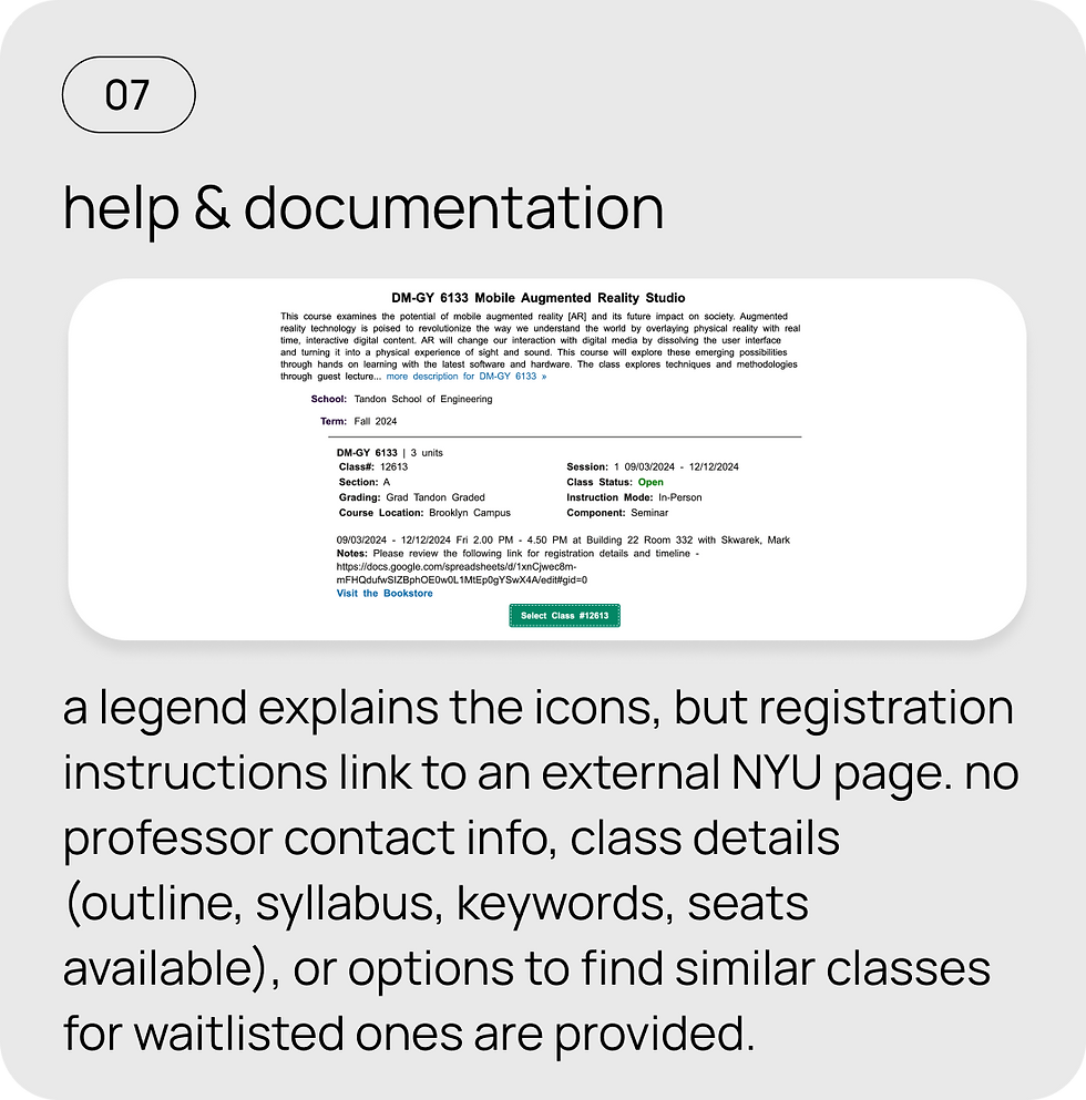
I conducted Heuristic Evaluation to understand the Albert's current usability issues
In conclusion, the heuristic evaluation reveals several usability issues, including confusing navigation, unclear icons, and missing key information. Addressing these areas will improve user satisfaction and make the system more intuitive and efficient. Implementing the recommended changes will streamline the overall experience.


I wanted to see how other US universities' LMS were solving the same problems
This analysis shows how NYU Albert can improve by incorporating clearer navigation, upfront course info, and bookmarking from Coursera, along with features like scannable calendars, seat availability, and credit tracking from University of Washington and Maryland. These changes would create a more intuitive and efficient user experience for Albert.


I interviewed 5 NYU students who regularly use Albert to manage their classes
to identify previously unknown struggles. The goal was to create a user archetype and add value through design principles.
Meet
Aditya, a methodical planner

"I need to know the class status and whether I’m eligible to enroll without having to ask my advisor. The system should provide that information quickly and clearly."
Key tasks:
Find class status easily
Search for courses using keywords
Swap courses efficiently
Pain Points:
• Difficulty seeing class status clearly
• Struggles to find out if he’s eligible to enroll without advisor help
• Complicated course swapping process with no clear error messages
Behaviour:
• Frustrated when navigating through multiple steps to find basic info
• Misses important buttons like “waitlist” due to unclear interface
Meet
Michelle, the Efficient Explorer

“I want to quickly access my department’s course list and find classes with a direct search. Too many steps and confusing filters make it hard to discover new courses.”
Key tasks:
Quickly access her major
Find interesting classes with less clicks
Pain Points:
• Search bar doesn’t yield many results
• Filters are confusing and cluttered, making navigation difficult
• Too many steps to reach her department’s course list
Behaviour:
• Skips using filters due to confusion and instead scrolls through options
• Misses academic deadlines due to hard-to-find info on course requirements
Use filters intuitvely
I mapped Aditya's and Michelle's journeys to identify areas for improving class status visibility, eligibility checks, course navigation, and user-friendly enrollment to enhance their overall experience.
I conducted initial usability testings with the users to understand the current state of the platform.
The task:
Browse for classes and enroll in a specific class for the upcoming semester.


Aditya's Journey
I want to be able to see the status of a class (full, open, waitlist) on the dashboard so that I can easily and quickly know if I am eligible to enroll or not and I won’t have to reach out to my advisor for information.
Michelle's Journey
I want to easily access my department page and save my favorite classes for later review, so I can avoid irrelevant information and manage my course selection more efficiently.
How might we simplify the student's academic journey, making it easy to find courses, enroll, and access class information?
Based on the research, there are several pain points that users are facing
-
Too many clicks and excessive scrolling to locate the school and department.
-
The filters on the left side of course search are cluttered, confusing, and not very helpful.
-
Course descriptions lack details on the syllabus, course outline, and project requirements.
-
No upfront notification that a student's credit limit has been reached, making it unclear when they can't add more classes.
-
The buttons for waitlisting and enrolling are not prominent, leading students to miss them.
-
The landing page is overcrowded with irrelevant information that doesn't help students.
-
Important academic deadlines for the semester are hard to find.
-
Finding the professor's email or reaching out to an advisor on the NYU website is cumbersome.
I came up with multiple potential solutions and to effectively prioritise the most relevant features, I utilised the MoSCoW technique

Before jumping in Figma, I wanted to visualise the concept and test the wireframe with users to understand if the solution makes sense
The concept is a simple, user-friendly platform that streamlines class registration, helping students save time and manage their enrollments with clear information and familiar features.


I tested the wireframes with the 5 users I conducted the interview with and they provided some key insights

Selected design approaches to solve the problem
These were the major redesigned screens which addresses Aditya and Michelle's frustrations while also keeping accessibility in mind.

A dynamic dashboard
An easy to understand dashboard of all things academic. Users can save their favourite classes for future, directly access their majors in a click, see an intuitive calendar showing their classes for the week and add various filters.

Easy Navigation
The redesign improved the navigation as students now need to click and scroll less. They can directly go to their school and expand the interface to select their major. They can also search or click on their ‘favourites’ button to directly access their major.

Accessible Information
Students can easily access important information such as class time, date, room, professor’s website/LinkedIn and any repository of present or past syllabus for the class. Students can also see the status of a class easily.

Intuitive Enrollment
Based on the class status, certain actions like enrolling and waitlising would be automatic. Students won’t be able to enroll if the class is closed, eliminating the need to go through the tedious process of enrolling only to end up with an error message. Classes which require a permission code would be highlighted with ‘red’ and an action icon which would turn to green with a success icon after entering the number. This greatly reduces the number of steps taken to enroll in a class with instant feedback.

The user-centered redesign of NYU Albert greatly improved the student experience, streamlining navigation and enhancing course enrollment and schedule viewing, resulting in higher satisfaction and efficiency.
By streamlining navigation, enhancing user engagement, and reducing enrollment time from 1 minute 14 seconds to just under 25 seconds, while also improving accessibility, this redesign concept for NYU Albert demonstrates a significant potential boost in user satisfaction and interaction, reflecting student-driven academic work aimed at improving the platform.
40%
reduction in enrollment errors
66%
reduction in task time
-
Improved accessibility, including customizable font sizes and a grayscale option for colorblind users.
-
Faster task completion, saving time on course selection and navigation.
-
Increased user engagement with features like the favorites list for easy course tracking.
UX PROJECTS
Checkout other case studies
![Showreel_-Moving-screens-with-parallax-[remix].gif](https://static.wixstatic.com/media/1e5aa0_2da69346dacd4ddea3e1e29cf399c540~mv2.gif/v1/fill/w_800,h_600,al_c,pstr/Showreel_-Moving-screens-with-parallax-%5Bremix%5D_gif.gif)
Discover how I helped Pomu identify its MVP by enabling fashion business owners to easily connect with their ideal manufacturers.

Discover how I empowered fashion sustainability through education and community and increased awareness by over 50% in users
Accessibility First
This redesign of NYU Albert emphasizes accessibility by allowing students to customize their user experience. Students can adjust the font size to their preference, making it easier to read course information and navigate the platform. Additionally, the option to switch the color scheme to grayscale is available, specifically designed for users with color blindness. This feature ensures that everyone, regardless of visual impairments, can easily access and engage with the platform, enhancing overall inclusivity.
